
How to Create a Dashboard with Data Visualization Tool Tableau with 2 Examples
Elice
9/27/2023
If an organization has a comprehensive view of its data and is leading the field with data-driven changes and responses, it can be said to have business intelligence or BI. Various BI tools provide BI solutions to help organizations make data-driven decisions. BI tools are used in various fields such as marketing, sales, customer service, etc. because they can analyze data collected from internal and external sources from multiple perspectives. One of the best examples of data visualization among various BI tools is Tableau. Tableau makes it easy to make data-driven decisions and understand the status quo through dashboards. In this module, we will briefly introduce Tableau, a prominent data visualization tool, and show you how to create Tableau dashboards while presenting data visualization examples that can benefit your business.
What are data analytics? Understanding Your Data Matters! - Watch now
What is a tableau?
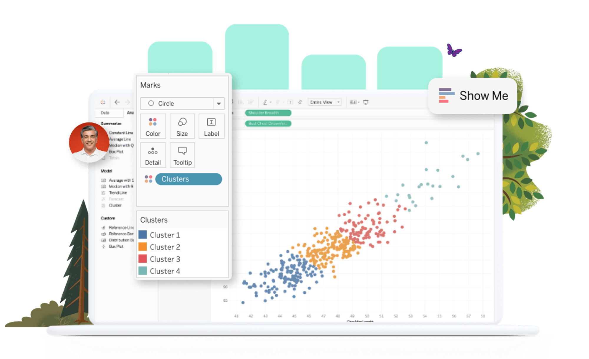
Let’s first find out what Tableau is. Tableau is a data visualization BI solution that makes it easier to navigate, manage, discover, share, and derive insights from data. Compared to other BI solutions, many businesses adopt data visualization because of the high degree of freedom it allows. When creating a chart, it can be made with drag-and-drop, making it relatively easy to use.
Tableau Features
What functions does Tableau offer for critical business data visualizations?
- Data Interworking: Connect data to a variety of platforms, from Excel, to CSV files and servers, consolidating and filtering data as needed.
- Visualization Chart Creation: Automatically create a visualization chart that synthesizes the desired data.
- Data Analysis: Tableau’s statistical functions allow for data analysis and results prediction.
- Device-customized dashboard: Each graph can be freely sized and named to suit different devices and allow for more accessibility.
What is a tableau dashboard?
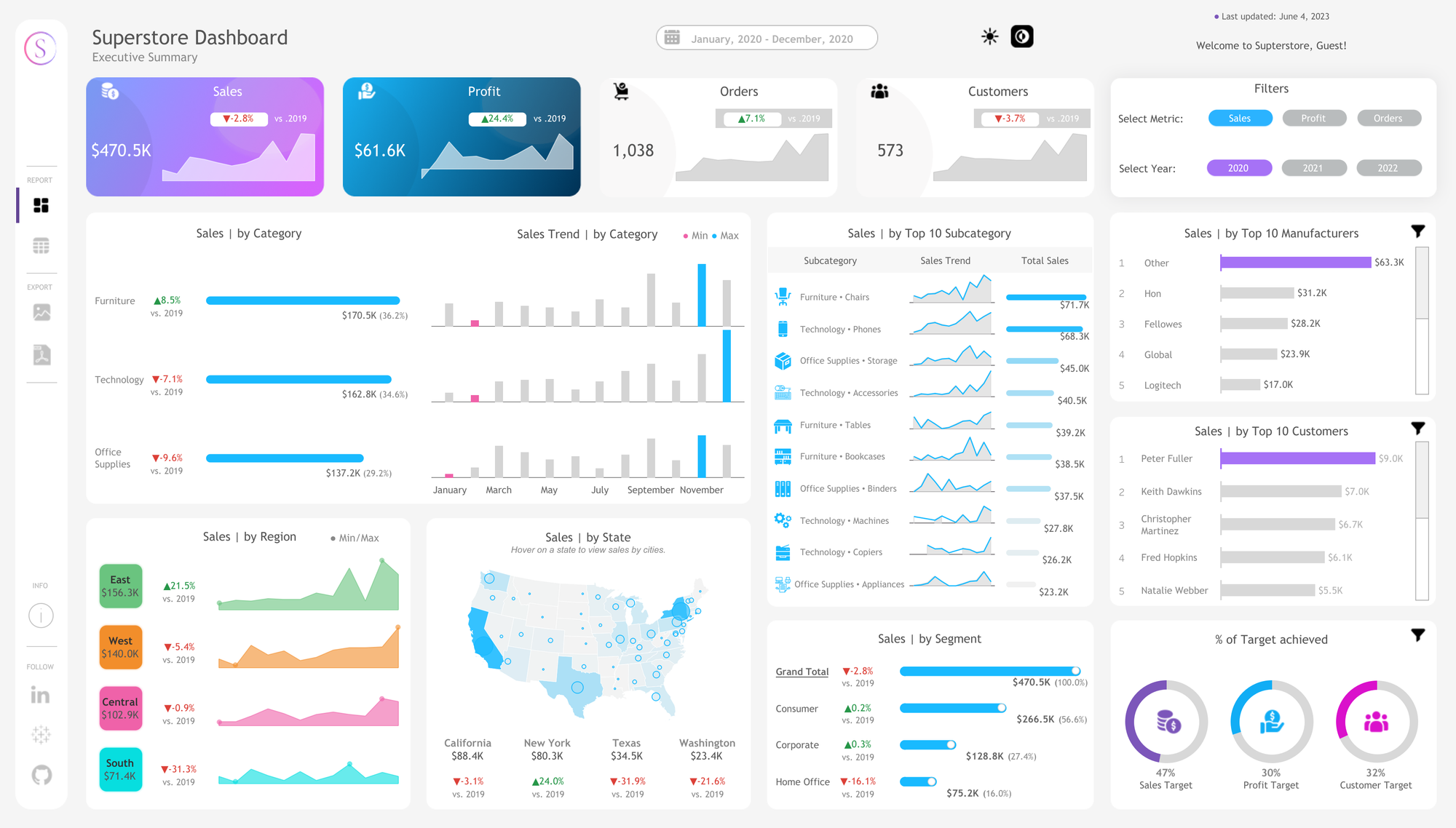
As I explained earlier, Tableau has a variety of features, and it provides a dashboard to help users find insights into their data and understand it intuitively. The dashboard in this case comes from the dashboards you find in the driver’s seat of a car or an airplane. Named after these dashboards, bundles of information began to be referred to as dashboards in BI solutions. Dashboards visualize and display a variety of information on a single screen, and can be seen as a comprehensive overview that allows for multiple points of data to be compared at once. Now, let’s take a look at the advantages of Tableau and Tableau dashboards.
What is data literacy? How to Build Data Literacy in 3 Steps - View now
Tableau Advantages
Visualization without coding.
The advantage of Tableau is that it doesn’t require coding knowledge. Tools are available right away without prior knowledge or programming skills.Easy to manage metadata
Tableau connects all databases, making it easy to get the information you want and make real-time connections. Data analysts and data engineers can work on imported data, visualize files, and then publish them to servers. This makes deployment, automation, and collaboration convenient, thus facilitating metadata management.Data can be imported regardless of size and range.
Tableau makes it easy to connect and extract data located in different sources. Since the location of where the actual data is stored is not important, information can be extracted from most platforms, including Excel, Oracle, PDF, Microsoft Azure, and Google Cloud SQL for analysis.Available on mobile, desktop, etc
Tableau servers can be accessed from anywhere, whether on mobile or desktop, regardless of location. This enables quick and easy access to data.
Tableau Dashboard Advantages
Businesses can gain various benefits from using dashboards.
Comprehend large amounts of data at a glance.
When you configure a dashboard, you can aggregate the data you have and visualize it for easy viewing. You can also organize complex datasets so that anyone can read them easily.Informs business decision-making
Employees not involved with development and data will be able to gain insights from visualized data and make business decisions.Intuitively understand your company’s situation
The dashboard can be used for decision-makers to understand their business situation in real-time, or for executives and employees to check their current work goals and achievement figures.
How to create a tableau dashboard
How should I go about creating and reaping all the benefits of a Tableau dashboard? Let’s take a step-by-step look at creating a tableau.
1) Plan the contents of the dashboard
Before creating a good Tableau dashboard, you will need to plan the contents of the dashboard. The content included in the dashboard should be organized according to the 5W1H principle (who, when, where, what, how, and why). Therefore, it is recommended to write down the contents that are to be included and organize them in a table using the 1H5W principle.
2) Size the dashboard
Before you create a full-scale table dashboard, choose an appropriate size that suits the content of the dashboard. The dashboard size must be selected in consideration of the situation, usually PowerPoint size (16:9) or a common PC resolution size (1920x1080) is recommended.
3) Plan a dashboard layout
Consider the layout and placement of charts The same two charts can convey different things based on how they are organized, so it is a good idea to draw a wireframe to plan the layout before creating your Tableau dashboard. If you’re having a tough time with the layout, it can be helpful to look up references on Google or the Tableau Public site.
4) Place charts after creating a new dashboard
Create a horizontal/vertical container that matches your planned layout. Then, choose the appropriate type, Checkered or Floating, and place the chart in the container. For reference, the checkerboard is a responsive type and will resize placed charts automatically, while the floating type will insert the charts how they were originally sized.
5) Apply dashboard action and UIUX elements
Use filters or actions to apply the action. Filter only the desired data values or set the shape and presence of an action based on user gestures.
6) Designing
Design using PowerPoint or Photoshop. Insert picture(s) underneath your Tableau project.
Tableau Dashboard Examples
Tableau Public Page
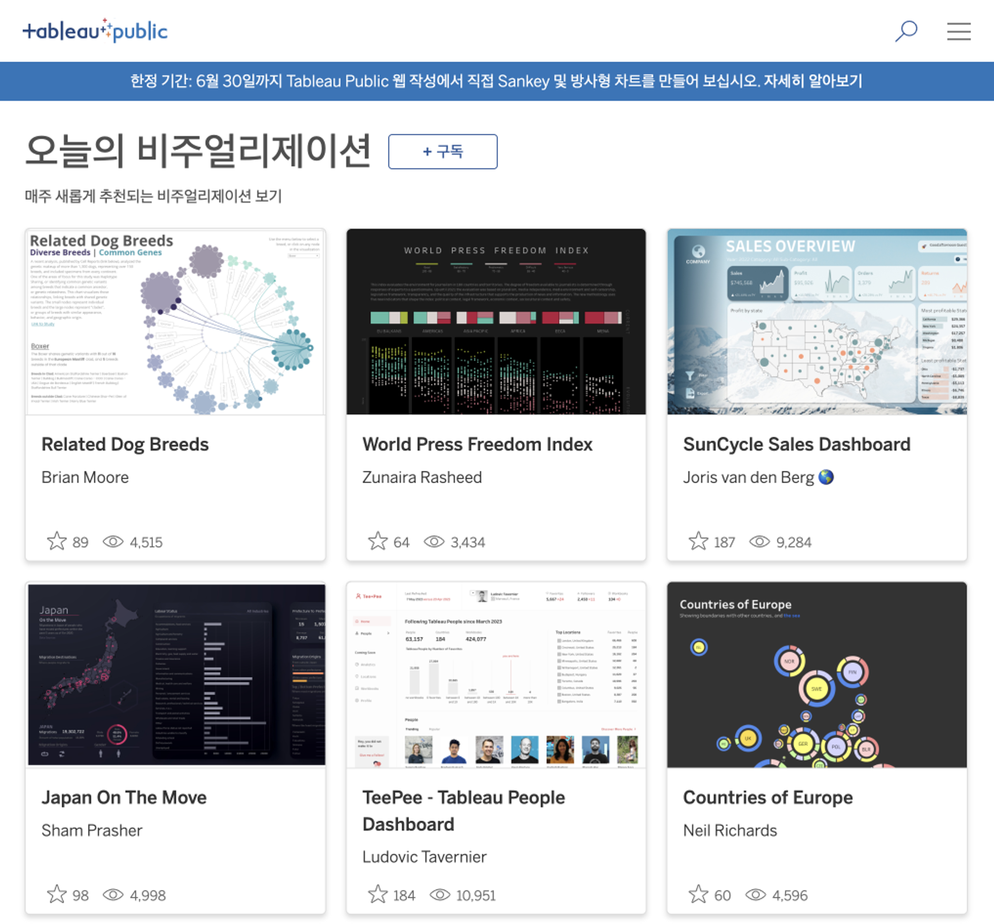
The Tableau Public site provides several dashboard examples. Usually, it’s only available as an image, but you can also download the template depending on the provider’s settings. We recommend that you search for the tags you want and find the appropriate reference.
Tableau Accelerators Dashboard Templates

Tableau Accelerators within the Tableau Public site share a variety of business dashboard templates that can be used to immediately create table dashboards. There are many easy-to-use, high-quality data visualization templates that even beginners can take advantage of, such as sales dashboards and PMO dashboards.
So far, we’ve learned about the BI solution Tableau, creating a Tableau dashboard, and examples of data visualization. Why not utilize the data visualization tool Tableau to create your own dashboard and streamline critical business decisions?
Elice provides training on how to visualize data and apply it to your field. You can learn how to visualize your data with Tableau, from the basics of Tableau to the practice of creating dashboards. If you want to cultivate data visualization capabilities for our employees, we recommend you consider data visualization training!
Data visualization training, bring it to your enterprise - contact us now
*This content is a copyrighted work protected by copyright law and is copyrighted by Elice.
*This content does not allow any secondary modifications or commercial utilization without prior consent.
- #DX
- #Data